UX Case Study
UX Case Study
Calmify: Designing a Mental Health App That Connects Patients & Clinics
Calmify: Designing a Mental Health App That Connects Patients & Clinics
Calmify: Designing a Mental Health App That Connects Patients & Clinics
My Role
My Role
My Role
Research & Product Design
Research & Product Design
Research & Product Design
Team
Team
Team
Me
Me
Me
Timeline
Timeline
Timeline
~14 days
~14 days
~14 days


Problem Statement
Problem Statement
Problem Statement
Managing mental health treatment isn’t just about attending therapy—it’s about keeping track of appointments, medications, and having the right support in between. Many patients struggle with organizing their treatment, leading to missed sessions and a lack of guidance when they need it most.
Managing mental health treatment isn’t just about attending therapy—it’s about keeping track of appointments, medications, and having the right support in between. Many patients struggle with organizing their treatment, leading to missed sessions and a lack of guidance when they need it most.
Overview
Overview
Overview
Calmify is designed to bridge the gap between clinics and patients by offering an easy way to track appointments, manage medications, and access instant support. With a clean, calming interface, it ensures that users can focus on their well-being without feeling overwhelmed by logistics. This case study focuses on the clinic user flow, highlighting how Calmify simplifies mental health management for those receiving professional care.
Calmify is designed to bridge the gap between clinics and patients by offering an easy way to track appointments, manage medications, and access instant support. With a clean, calming interface, it ensures that users can focus on their well-being without feeling overwhelmed by logistics. This case study focuses on the clinic user flow, highlighting how Calmify simplifies mental health management for those receiving professional care.
•••
•••
•••
Target Audience 🫂
Target Audience 🫂
Target Audience 🫂
Calmify is built for people struggling with anxiety and depression who need an easy way to manage their mental health.
Clinic Users – Patients registered through a clinic, who can track appointments, medications, and medical history.
General Users – Anyone looking for AI-driven support and self-care tools like guided breathing, meditation, and instant chat assistance.
Whether connected to a clinic or managing things independently, Calmify ensures help is always within reach.
While Calmify serves both clinic-registered users and general users, this case study focuses solely on the clinic flow—the experience designed for users onboarded through healthcare providers. The general user flow exists, but the primary challenge and design decisions revolved around making the clinic-integrated experience seamless.
While Calmify serves both clinic-registered users and general users, this case study focuses solely on the clinic flow—the experience designed for users onboarded through healthcare providers. The general user flow exists, but the primary challenge and design decisions revolved around making the clinic-integrated experience seamless.
•••
•••
•••
My Design Process 🎨
My Design Process 🎨
My Design Process 🎨
Understanding the Problem
Understanding the Problem
Structure the User Experience
Structure the User Experience
High-Fidelity UI & Prototyping
High-Fidelity UI & Prototyping
Refining & Iterating
Refining & Iterating
This process wasn’t linear—I frequently jumped between stages, refining designs while working on final screens, revisiting research insights, and ensuring every detail contributed to a better user experience.
This process wasn’t linear—I frequently jumped between stages, refining designs while working on final screens, revisiting research insights, and ensuring every detail contributed to a better user experience.
Also, Given the limited timeline of this project, I couldn’t go the traditional route of conducting in-depth surveys or interviews. Instead, I leaned on AI-powered research and secondary resources to gather quick insights.
Of course, not everything can come from data — some of it came from my own assumptions as a UX designer. And let’s be honest, assumptions in UX are like free trial versions: sometimes they expire quickly, but they’re still worth testing. 😅
This mix of AI inputs + designer intuition helped me identify the key pain points and user needs to move forward with confidence.

•••
•••
•••

UX Context
UX Context
UX Context
Designing for Ease, Clarity, and Support
Designing for Ease, Clarity, and Support
Designing for Ease, Clarity, and Support
Every tap, every screen, every detail—designed to make support feel effortless and navigation stress-free.
Every tap, every screen, every detail—designed to make support feel effortless and navigation stress-free.
Every tap, every screen, every detail—designed to make support feel effortless and navigation stress-free.

•••
•••
•••
🔄 Thinking in Flows
🔄 Thinking in Flows
Built flows tailored to clinic users and normal user.
Prioritized appointment tracking, treatment history, and support access.
Reworked the flow multiple times to cut friction and avoid confusing loops.
Built flows tailored to clinic users and normal user.
Prioritized appointment tracking, treatment history, and support access.
Reworked the flow multiple times to cut friction and avoid confusing loops.
⚙️ Intentional Decisions
⚙️ Intentional Decisions
Brought key info (like next appointment) straight to the homepage.
Avoided deep nesting — no more “where was that option again?” moments.
Used layout and hierarchy to gently guide users through the experience.
Brought key info (like next appointment) straight to the homepage.
Avoided deep nesting — no more “where was that option again?” moments.
Used layout and hierarchy to gently guide users through the experience.
From Idea to Design
From Idea to Design
From Idea to Design
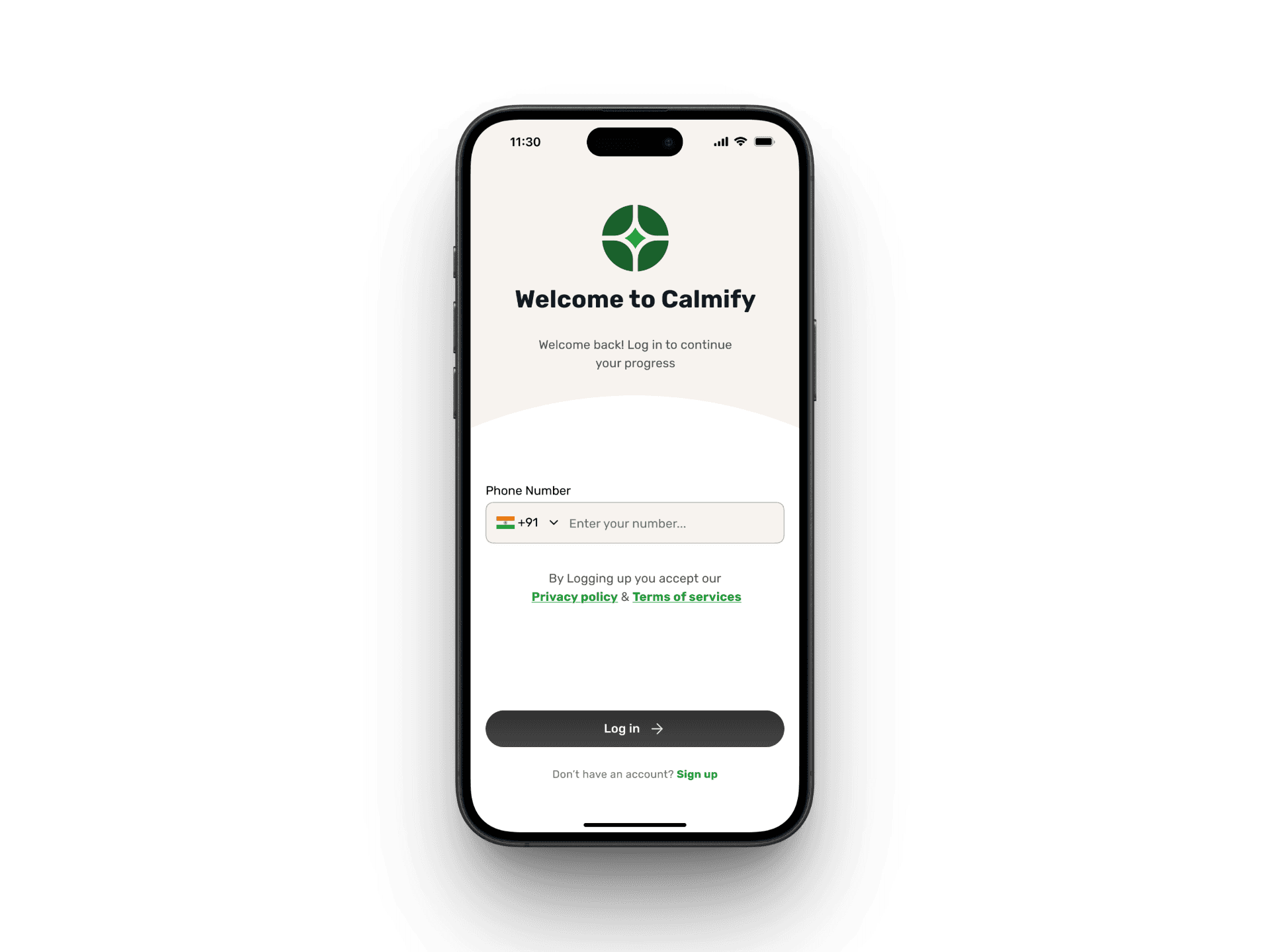
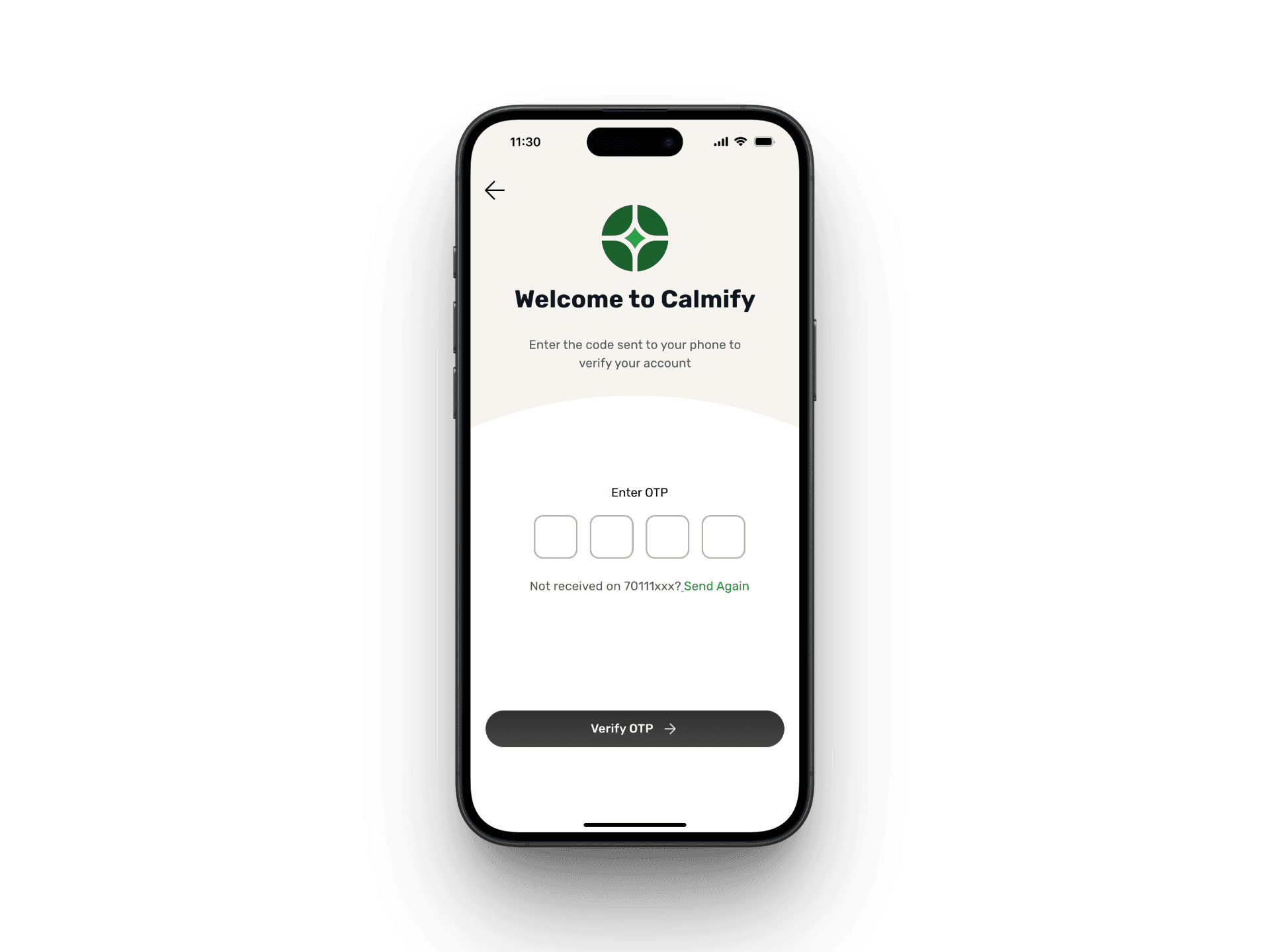
Onboarding: Setting the Right Tone from the Start
Clinic users skip the usual signup hassle even for the new users as they’re added via backend and simply verify with OTP. The splash and onboarding screens set the tone early, helping users understand what Calmify offers and what to expect from the app.
Clinic users skip the usual signup hassle even for the new users as they’re added via backend and simply verify with OTP. The splash and onboarding screens set the tone early, helping users understand what Calmify offers and what to expect from the app.


Homepage – A Gentle Gateway to Support
The homepage is designed to be warm, clear, and resourceful. It balances personalization (appointments, medication, daily tips) with on-demand support (AI chat, soothing sounds, and resources). The goal was to create a single hub where users feel guided but never overwhelmed.
The homepage is designed to be warm, clear, and resourceful. It balances personalization (appointments, medication, daily tips) with on-demand support (AI chat, soothing sounds, and resources). The goal was to create a single hub where users feel guided but never overwhelmed.

The homepage acts as a gentle hub — balancing care, guidance, and calm. From personal health reminders to instant support, everything is just a tap away
Managing Appointments with Ease
Instead of making users dig through layers, I surfaced what matters most — their next visit. A dedicated card, visible both on the homepage and appointment page, clearly shows the doctor’s name, photo, visit type, and timing.
Instead of making users dig through layers, I surfaced what matters most — their next visit. A dedicated card, visible both on the homepage and appointment page, clearly shows the doctor’s name, photo, visit type, and timing.

Past appointments are neatly listed with a summary preview that expands on tap. While bookings come directly from the clinic, users never lose track of what’s coming or what happened last — everything is right there when they need it.
Medication & Treatment History at a Glance
A lot of users struggle to recall what was prescribed, when, or why a certain medication was given. For clinic users dealing with mental health challenges, this confusion can lead to stress or missed doses. I wanted to eliminate that entirely.
To do this, I broke down the experience into three focused parts — all easily reachable within a few taps:
Clear Medication Tracking
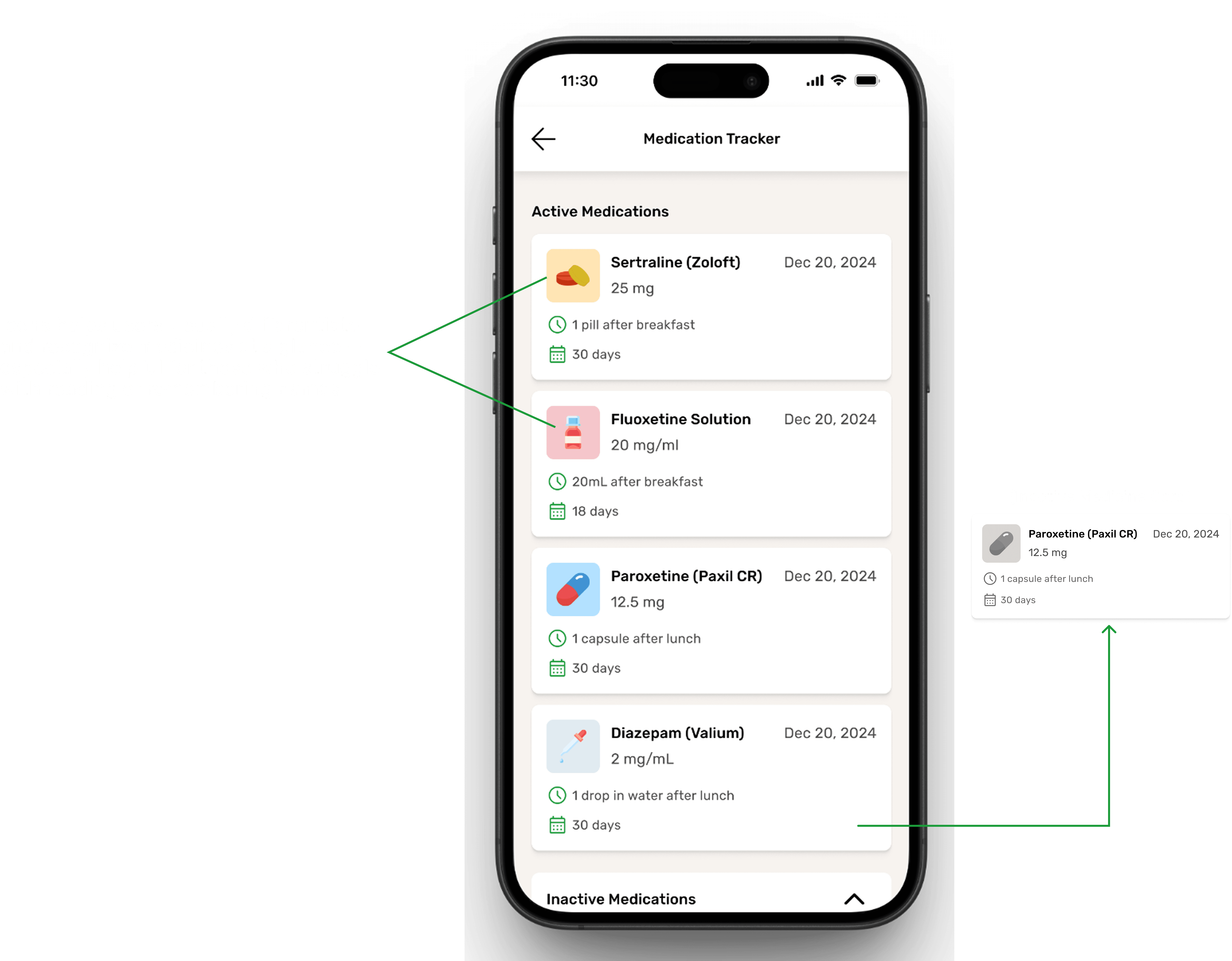

Users can view all active and inactive medications in one place — with dosage, instructions like “1 pill after breakfast,” and how long each treatment lasts. This screen avoids clutter and presents everything in a format that feels more like a checklist than a medical file.
b. Visual Test Reports That Make Sense


Users can view all active and inactive medications in one place — with dosage, instructions like “1 pill after breakfast,” and how long each treatment lasts. This screen avoids clutter and presents everything in a format that feels more like a checklist than a medical file.
c. Summarized Appointment History


Each past appointment comes with a one-line summary — not too long, just enough to remind the user what was discussed or advised. These summaries can be expanded with a tap. It keeps the focus on important insights while giving the user full control
AI Chat Support for Instant Guidance
In moments when users feel overwhelmed or unsure, Calmify’s AI chat offers immediate, judgment-free support. Placed strategically for quick access, the chat acts as a steady hand between appointments — available anytime the user needs to talk or get guidance.
In moments when users feel overwhelmed or unsure, Calmify’s AI chat offers immediate, judgment-free support. Placed strategically for quick access, the chat acts as a steady hand between appointments — available anytime the user needs to talk or get guidance.

The AI support screen is designed for clarity and calm. Users see a clear intro explaining what the chatbot can and can’t do, followed by quick-start questions and voice input. It’s built to offer comfort, not confusion — especially in tough moments.

The AI not only listens, it guides. By suggesting helpful in-app articles mid-conversation, it offers users timely support that feels personal. These resources keep users engaged, nurtured, and gently nudged toward healthier habits.
🧠 Why I Chose a Conversational Chat Over Session-Based Threads
🧠 Why I Chose a Conversational Chat Over Session-Based Threads
When designing the AI chat, I had two directions to consider:
A conversational chat that feels like texting a friend — similar to what we see in apps like Meta AI and Snapchat AI.
A session-based chat — where each new conversation starts fresh, like ChatGPT, Gemini, or Grok.
When designing the AI chat, I had two directions to consider:
A conversational chat that feels like texting a friend — similar to what we see in apps like Meta AI and Snapchat AI.
A session-based chat — where each new conversation starts fresh, like ChatGPT, Gemini, or Grok.
I chose the conversational format, and here’s why:
I chose the conversational format, and here’s why:
✅ Feels More Human
Apps like Meta and Snapchat AI mimic real conversations — messages feel continuous, familiar, and personal. This design taps into how we already communicate with friends and family. That tone felt right for a mental health context — calm, casual, and emotionally safe.
✅ Feels More Human
Apps like Meta and Snapchat AI mimic real conversations — messages feel continuous, familiar, and personal. This design taps into how we already communicate with friends and family. That tone felt right for a mental health context — calm, casual, and emotionally safe.
While researching Snapchat AI, I noticed chats disappear after 24 hours. This works because Snapchat users already expect that behavior.
But for Calmify, I leaned more toward Meta’s approach, where messages stay unless deleted. It makes the experience feel more grounded and less like a “tool” and more like a “supportive companion.”
🧪 This Could be Evolve?
If I had run user interviews or testing, I could have validated whether users prefer chat history to stay or auto-expire after some time. That remains an open question for future iterations.
🧪 This Could be Evolve?
If I had run user interviews or testing, I could have validated whether users prefer chat history to stay or auto-expire after some time. That remains an open question for future iterations.
🧘♂️ Why Not a Session-Based Chat?
Starting a new session every time might feel robotic. In mental health support, continuity matters. A flowing chat — even with AI — feels more natural and can help users stay calm. It mirrors the comforting rhythm of a normal conversation.
🧘♂️ Why Not a Session-Based Chat?
Starting a new session every time might feel robotic. In mental health support, continuity matters. A flowing chat — even with AI — feels more natural and can help users stay calm. It mirrors the comforting rhythm of a normal conversation.
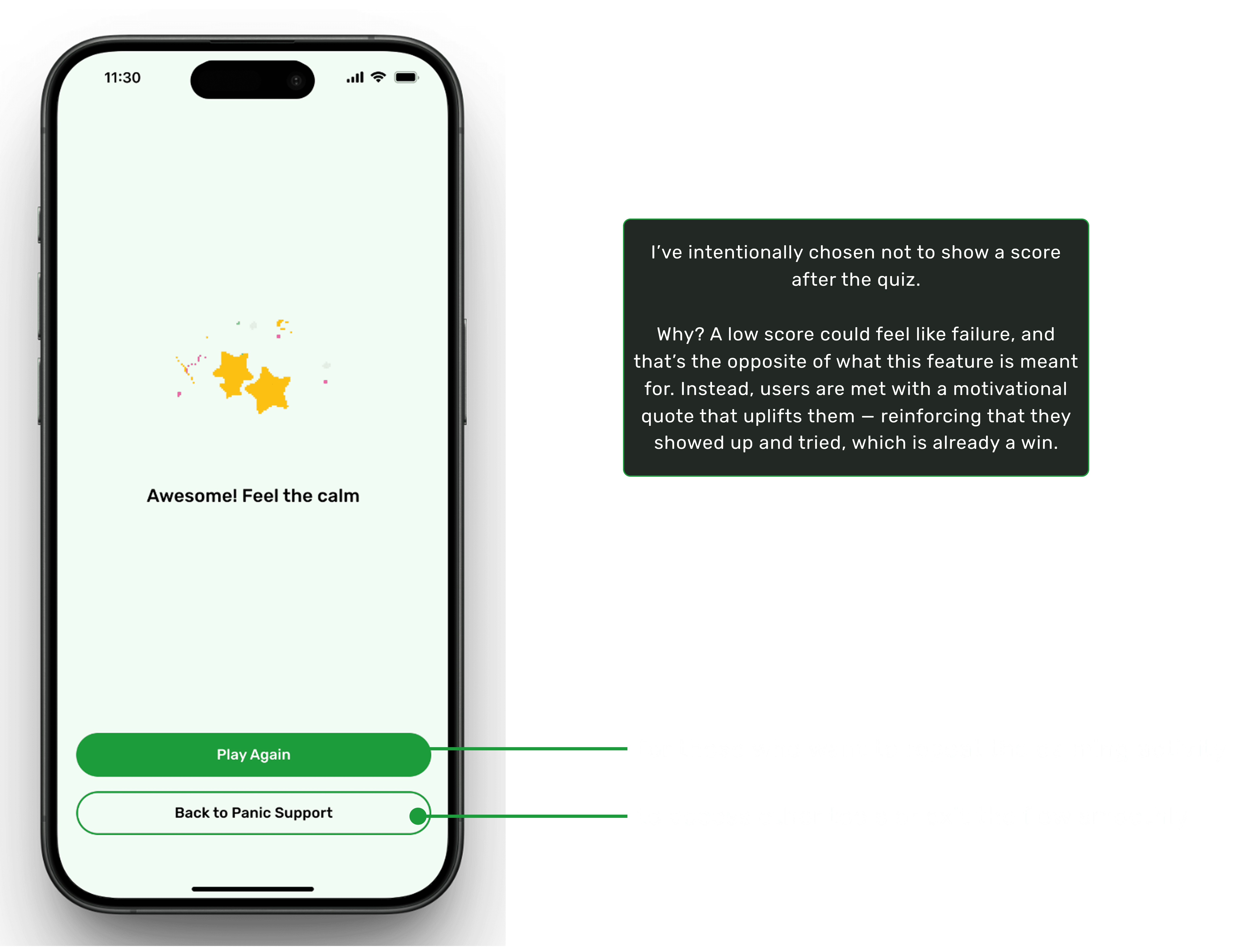
Panic Support – A Calming Distraction
When anxiety hits, even small actions can anchor the mind. Panic Support offers a simple math-based distraction — not to test intelligence, but to slow racing thoughts.
When anxiety hits, even small actions can anchor the mind. Panic Support offers a simple math-based distraction — not to test intelligence, but to slow racing thoughts.
a. From Panic Support to Quick Help

This GIF shows how users can move seamlessly from the main Panic Support screen to the first self-help question. It highlights the clean, distraction-free interface that sets the tone for the upcoming interaction, without revealing the full question-answer flow.
A dedicated space for moments of heightened anxiety or panic. The goal is to provide immediate relief tools and reassuring guidance in one place.

Reassurance Banner – Gentle, calming affirmation at the top to help ground the user (“Breathe in peace, breathe out stress”).
Quick Action Exercise – A short, focused activity (“Refocus Your Mind”) to shift attention and regain clarity through a simple math challenge.
Helpful Resources – Curated self-care guides with short reading times for easy accessibility.
Daily Tips – Bite-sized, actionable tips to reinforce calming techniques (e.g., timed breathing patterns).
UX Intent:
The design ensures users don’t have to think too much in a moment of stress—everything is accessible within one scroll, with the primary action (“Start Exercise”) visually emphasized in green to guide focus.
UX Intent:
The design ensures users don’t have to think too much in a moment of stress—everything is accessible within one scroll, with the primary action (“Start Exercise”) visually emphasized in green to guide focus.
Thoughtful Design Choices for a Calmer Quiz Experience
Thoughtful Design Choices for a Calmer Quiz Experience

Walkthrough of Exercise
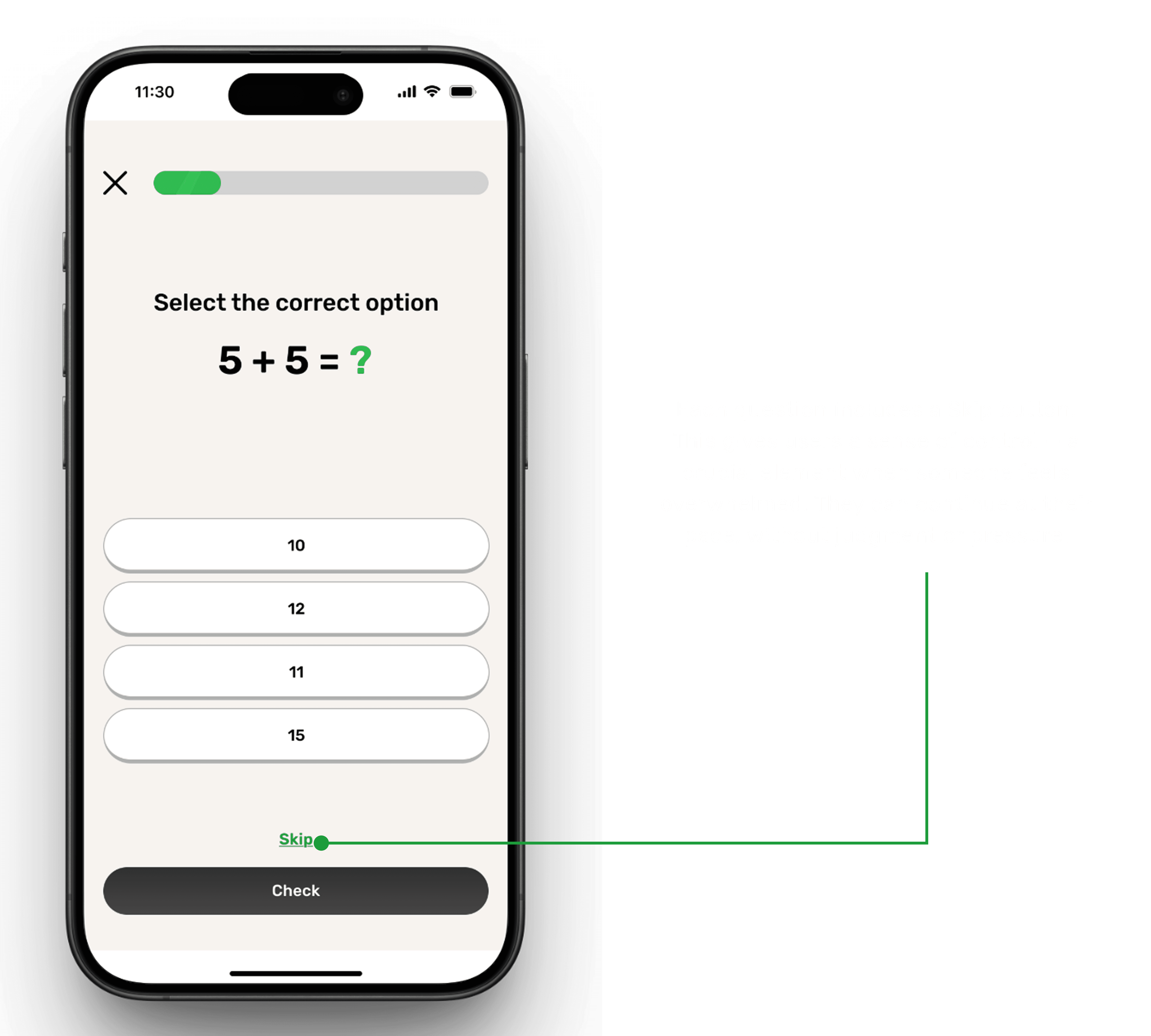
No pressure — users can skip if they’re not ready, keeping the flow stress-free
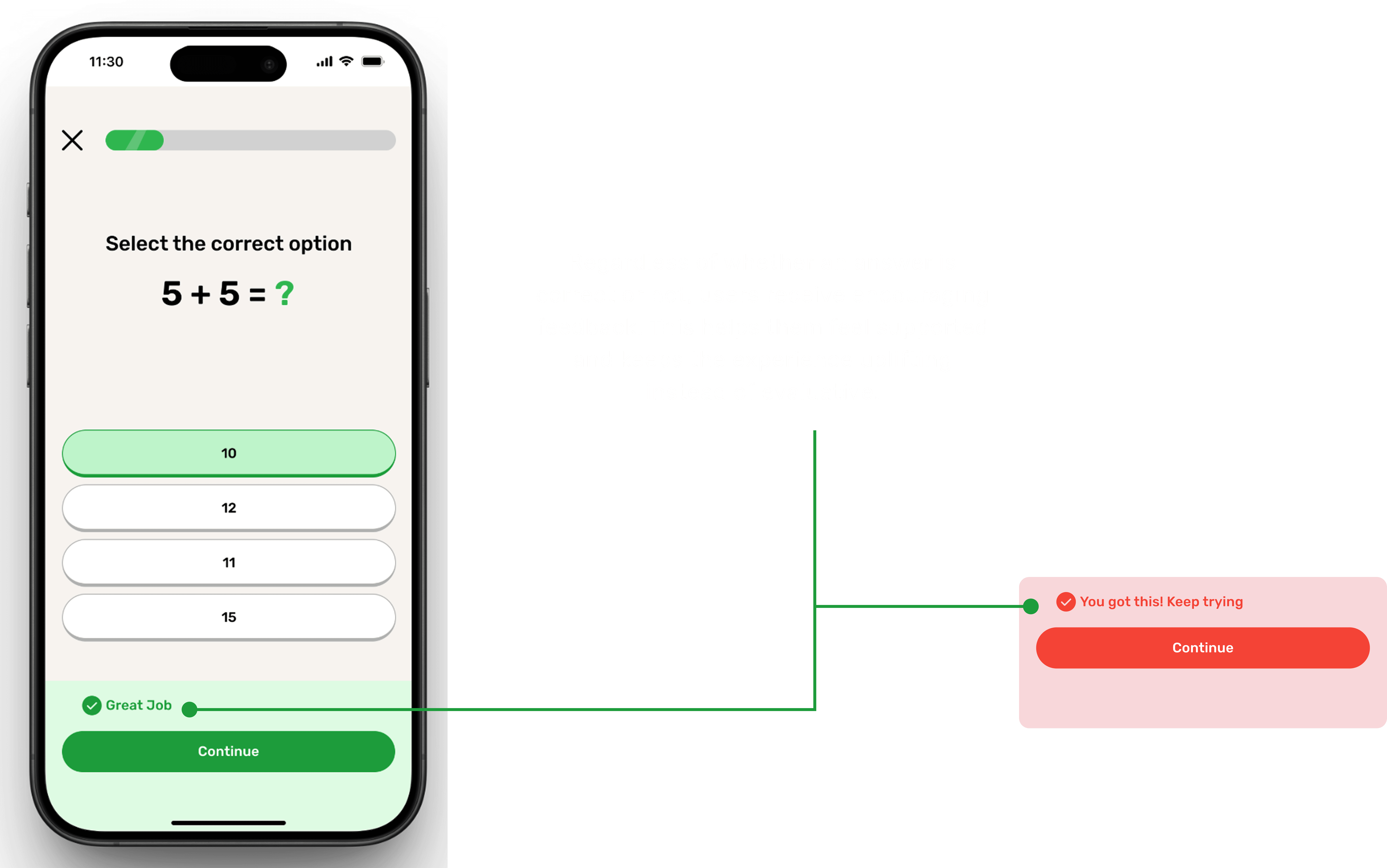
Positive reinforcement after every response — correct or not — to encourage progress
✨ Room for Improvement
In the current quiz flow, users select an option and then tap a Check button to confirm their choice. This works, but I realized that without user testing, I couldn’t be sure whether this was the most calming approach.
Some users might prefer immediate feedback upon selecting an answer (reducing extra clicks), while others might feel more comfortable with a confirmation step before seeing the result.
💡 With usability testing, I could validate which interaction feels smoother and more supportive for users in an anxious state.
A calming interface with soothing colors and smooth transitions for a relaxed experience
Transition to Dark Theme
Transition to Dark Theme
Transition to Dark Theme

Dark Mode Design Decision
Dark Mode Design Decision
Dark Mode Design Decision
Why Dark Mode?
Research shows that a large percentage of people experiencing depression fall within the 16–32 age group. This demographic is:
Digitally literate (grew up using smartphones and apps daily).
More accustomed to personalization in digital products.
Heavily inclined towards dark mode, as it reduces eye strain and feels more modern.
Design Process in Figma
I leveraged Figma Variables, which made it easy to toggle between light and dark themes.
This allowed quick theme switching without redesigning every component.
Still, I had to fine-tune specific colors (like calming blue and accent shades) to ensure they retained their intended psychological effect in dark mode.
Impact on User Experience
Supports accessibility for users spending long hours on their devices.
Creates a calmer, more immersive environment—critical for an app targeting mental health.
Gives users choice and control, which aligns with mental wellness principles.
Impact on User Experience
Supports accessibility for users spending long hours on their devices.
Creates a calmer, more immersive environment—critical for an app targeting mental health.
Gives users choice and control, which aligns with mental wellness principles.
Impact & Reflection
Impact & Reflection
Impact & Reflection
🌟 What Makes Calmify Stand Out
🌟 What Makes Calmify Stand Out
🌟 What Makes Calmify Stand Out
Dual Purpose Approach – Unlike most mental health apps that only focus on meditation or calming exercises, Calmify bridges the gap between clinics and patients.
Holistic Care – It not only offers instant calming techniques (music, breathing, journaling) but also integrates with clinic systems for reminders, medical history, and appointments.
Accessibility in 2–3 Clicks – The app is intentionally designed to make key features available with minimal effort, ensuring ease of use even during stressful moments.
🔍 Areas for Improvement
🔍 Areas for Improvement
🔍 Areas for Improvement
If I had more time, I would:
Conduct user testing to validate the effectiveness of flows such as the quiz/assessment journey and refine them further.
Do in-depth primary research (surveys, interviews) to replace some assumptions and make the design even more user-centered.
Explore advanced personalization — like tailoring calming techniques based on user mood patterns.
🎓 Key Learnings
🎓 Key Learnings
🎓 Key Learnings
Designing for sensitive topics taught me the importance of empathy, clarity, and not overwhelming users with options.
Simplicity is powerful — providing the right feature at the right time matters more than adding too many.
Color psychology plays a crucial role in mental health design. Choosing a calming palette directly affects how users emotionally connect with the app.
Conclusion
Conclusion
Conclusion
🌟 What Makes Calmify Stand Out
🌟 What Makes Calmify Stand Out
🌟 What Makes Calmify Stand Out
Calmify was more than just a design exercise — it was a chance to think about how digital products can genuinely support people dealing with anxiety and depression. By combining clinic-driven features with calming techniques, the app offers something unique: a supportive bridge between professional help and self-care.
Calmify was more than just a design exercise — it was a chance to think about how digital products can genuinely support people dealing with anxiety and depression. By combining clinic-driven features with calming techniques, the app offers something unique: a supportive bridge between professional help and self-care.
This project helped me grow as a designer — balancing functionality, sensitivity, and simplicity in one experience.
This project helped me grow as a designer — balancing functionality, sensitivity, and simplicity in one experience.
For cheking both clinical and non-clinical flow click on 👉🏻 Figma File.
For cheking both clinical and non-clinical flow click on 👉🏻 Figma File.
💡 If you’d like to explore more of my design work, feel free to check out my portfolio.
And if you have any opportunities or feedback, I’d love to connect with you on LinkedIn.
💡 If you’d like to explore more of my design work, feel free to check out my portfolio.
And if you have any opportunities or feedback, I’d love to connect with you on LinkedIn.
Always up for design convos, feedback swaps, or geeking out over interfaces
Always up for design convos, feedback swaps, or geeking out over interfaces

If you're building something thoughtful, I'd love to hear from you
If you're building something thoughtful, I'd love to hear from you
If you're building something thoughtful, I'd love to hear from you
©2025 Designed by Sourab Jha (Portfolio ver. IV)