UX Case Study
UX Case Study
End-to-end product fixes: homepage, status, and document flows
End-to-end product fixes: homepage, status, and document flows
End-to-end product fixes: homepage, status, and document flows
My Role
My Role
My Role
Research & Product Design
Research & Product Design
Research & Product Design
Team
Team
Team
Product Designer, Product Manager, Developers
Product Designer, Product Manager, Developers
Product Designer, Product Manager, Developers


Overview
Overview
Overview
Vitto is a digital lending platform that provides business loans to small startups and MSMEs in tier-2 and tier-3 cities. Its app enables users to apply for business loans digitally and paperlessly.
When I joined Vitto, I was assigned to redesign the upper loan funnel of our B2C app — everything from the homepage to the first few stages of the loan journey
This part of the experience included:
Homepage (loan entry points)
Loan status and progress tracking
Document upload and verification flow
The goal was to reduce user drop-offs, simplify navigation, and improve clarity for users who were applying for loans for the first time — often on low-end phones and with limited digital experience.
Problem Statement
Problem Statement
Problem Statement
Users applying for loans frequently dropped off during the document submission and status-tracking steps. From support feedback and internal team discussions, we learned that users were unsure about document requirements, upload status, and next steps, which led to repeated failed attempts and support escalations. This increased operations workload and slowed down application completion time.
Goal: Reduce confusion in the onboarding and document flows, improve clarity of status communication, and enable more users to complete the application independently without support intervention.
What I Did?
What I Did?
What I Did?
Conducted user research with real users
Conducted user feedback review from credit & sales team
Mapped the existing onboarding + document flows and identified friction points
Created revised flow architecture, UI prototypes, and microcopy updates
Coordinated with engineering on feasibility and handoff specifications
•••
•••
•••
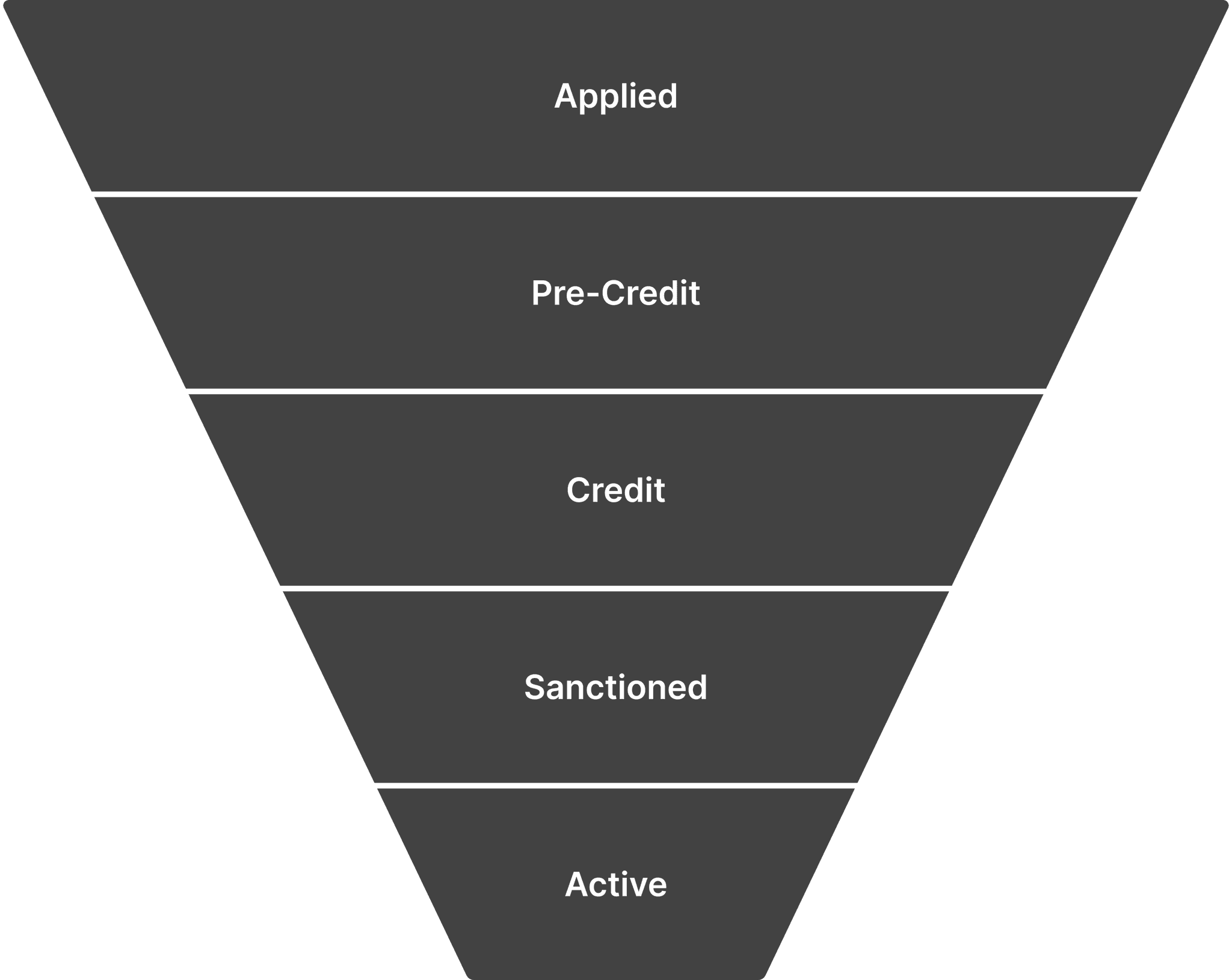
Why Upper Funnel (Applied Stage)?
Why Upper Funnel (Applied Stage)?
Why Upper Funnel (Applied Stage)?
Users arrive here organically — either from ads or by discovering the app on the Play Store.
This stage is self-driven — users explore and complete it on their own, with minimal assistance.
As users move to later stages, human intervention (credit team, verification) increases.
Hence, creating a clear, confident, and frictionless experience here was critical to drive conversions and build trust early.

UX Research
UX Research
UX Research
•••
•••
•••
Understanding Our Users
Understanding Our Users
Understanding Our Users
To redesign the loan journey, I first needed to uncover how real users from tier-2 and 3 cities experienced it.
To redesign the loan journey, I first needed to uncover how real users from tier-2 and 3 cities experienced it.

User Research
User Research
User Research
To understand our users better, I used a mix of conversations, team insights, and analytics. This helped me see the full picture — what users said, what they did, and what our team observed.
Spoke with users who dropped off early and those who completed their loan journey.
Connected with sales representatives to learn on-ground user behavior and challenges.
Reviewed Google Analytics to understand device usage, performance issues, and drop-offs.
This approach helped bridge empathy with data — revealing patterns behind why users struggled or succeeded.

Auditing Existing App
Auditing Existing App
Auditing Existing App
A step-by-step redesign focused on simplifying decisions, improving discoverability, and building user confidence
A step-by-step redesign focused on simplifying decisions, improving discoverability, and building user confidence
Understanding the Problem
Understanding the Problem
Structure the User Experience
Structure the User Experience
High-Fidelity UI & Prototyping
High-Fidelity UI & Prototyping
Refining & Iterating
Refining & Iterating

Homepage
The homepage serves as the first touchpoint for users entering the loan journey. However, the layout lacked focus—multiple CTAs competed for attention, and the primary “Apply Loan” action wasn’t visually dominant. Key entry points were scattered, making it unclear where users should begin, which led to confusion and inconsistent funnel tracking
The homepage serves as the first touchpoint for users entering the loan journey. However, the layout lacked focus—multiple CTAs competed for attention, and the primary “Apply Loan” action wasn’t visually dominant. Key entry points were scattered, making it unclear where users should begin, which led to confusion and inconsistent funnel tracking
Applied Stage Funnel
The homepage serves as the first touchpoint for users entering the loan journey. However, the layout lacked focus—multiple CTAs competed for attention, and the primary “Apply Loan” action wasn’t visually dominant. Key entry points were scattered, making it unclear where users should begin, which led to confusion and inconsistent funnel tracking
The homepage serves as the first touchpoint for users entering the loan journey. However, the layout lacked focus—multiple CTAs competed for attention, and the primary “Apply Loan” action wasn’t visually dominant. Key entry points were scattered, making it unclear where users should begin, which led to confusion and inconsistent funnel tracking


Inaccessible font sizes (as small as 9–10px)
Inaccessible font sizes (as small as 9–10px)
Disorganized design tokens and inconsistent
Disorganized design tokens and inconsistent
Disorganized design tokens and inconsistent
Poor color contrast and inconsistent typography
Poor color contrast and inconsistent typography
Poor color contrast and inconsistent typography
No proper contextual screen handling all the edge case
No proper contextual screen handling all the edge case
No proper contextual screen handling all the edge case
Hidden interactions on the loan status card
Hidden interactions on the loan status card
Hidden interactions on the loan status card
Refining & Iterating
•••
•••
•••
Key Insights
Key Insights
Key Insights
Upper Funnel-Applied Stage
Upper Funnel-Applied Stage
Upper Funnel-Applied Stage
Users often dropped off early as they didn’t fully understand what Vitto offered or how to begin their loan journey.
Users often dropped off early as they didn’t fully understand what Vitto offered or how to begin their loan journey.
The loan process felt unclear, leaving users unsure of progress or next steps.
The loan process felt unclear, leaving users unsure of progress or next steps.
Essential actions were hidden, reducing discoverability and increasing confusion.
Essential actions were hidden, reducing discoverability and increasing confusion.
Small text and weak contrast made reading difficult, especially for users in bright or low-end device environments.
Small text and weak contrast made reading difficult, especially for users in bright or low-end device environments.
The interface lacked design consistency, making the experience feel unreliable.
The interface lacked design consistency, making the experience feel unreliable.
•••
•••
•••
Refactoring
Refactoring
Refactoring
Redesigning for Clarity, Trust & Action
Redesigning for Clarity, Trust & Action
Redesigning for Clarity, Trust & Action
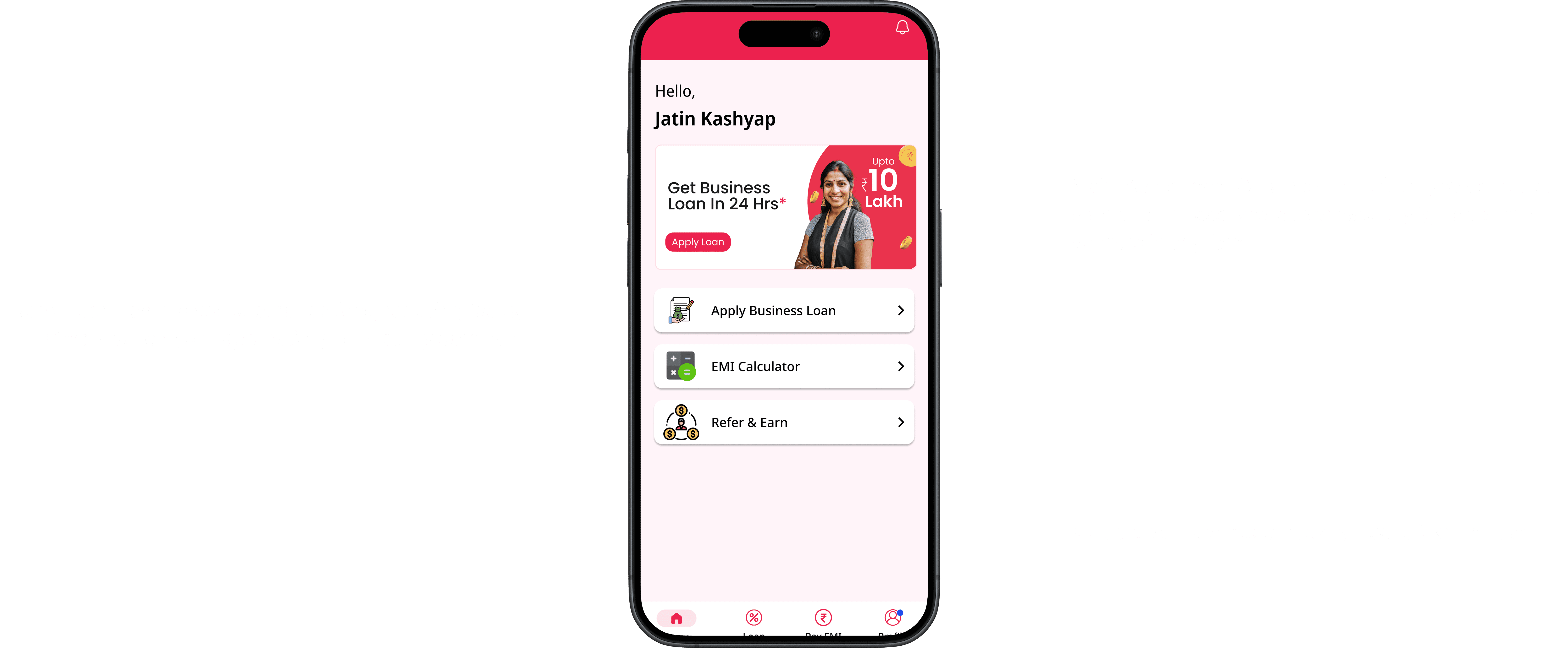
Homepage
The homepage was redesigned to create a clear, focused starting point for users. It highlights the primary loan action with strong visual hierarchy, guiding first-time users to navigate confidently without distractions.
The homepage was redesigned to create a clear, focused starting point for users. It highlights the primary loan action with strong visual hierarchy, guiding first-time users to navigate confidently without distractions.

Placed “Apply Business Loan” CTA in the first fold — ensured the primary action appears immediately on screen without scrolling, paired with a high-contrast button style to make it visually dominant and easy to identify.
Placed “Apply Business Loan” CTA in the first fold — ensured the primary action appears immediately on screen without scrolling, paired with a high-contrast button style to make it visually dominant and easy to identify.
Simplified the homepage with a single, clear loan entry point — removed multiple competing CTAs and banners, guiding users toward one focused action path to start their loan journey confidently.
Simplified the homepage with a single, clear loan entry point — removed multiple competing CTAs and banners, guiding users toward one focused action path to start their loan journey confidently.
Applied Stage Funnel
The homepage was redesigned to create a clear, focused starting point for users. It highlights the primary loan action with strong visual hierarchy, guiding first-time users to navigate confidently without distractions.
The homepage was redesigned to create a clear, focused starting point for users. It highlights the primary loan action with strong visual hierarchy, guiding first-time users to navigate confidently without distractions.

Established a consistent type scale — defined a structured typography system with a minimum 12px body size, balanced line height, and optimized hierarchy to ensure comfortable reading across low-end and small-screen devices.
Established a consistent type scale — defined a structured typography system with a minimum 12px body size, balanced line height, and optimized hierarchy to ensure comfortable reading across low-end and small-screen devices.
Defined clear color contrast ratios — created structured color tokens for different states and scenarios, ensuring visual consistency, strong contrast, and full alignment with WCAG guidelines across the entire interface.
Defined clear color contrast ratios — created structured color tokens for different states and scenarios, ensuring visual consistency, strong contrast, and full alignment with WCAG guidelines across the entire interface.
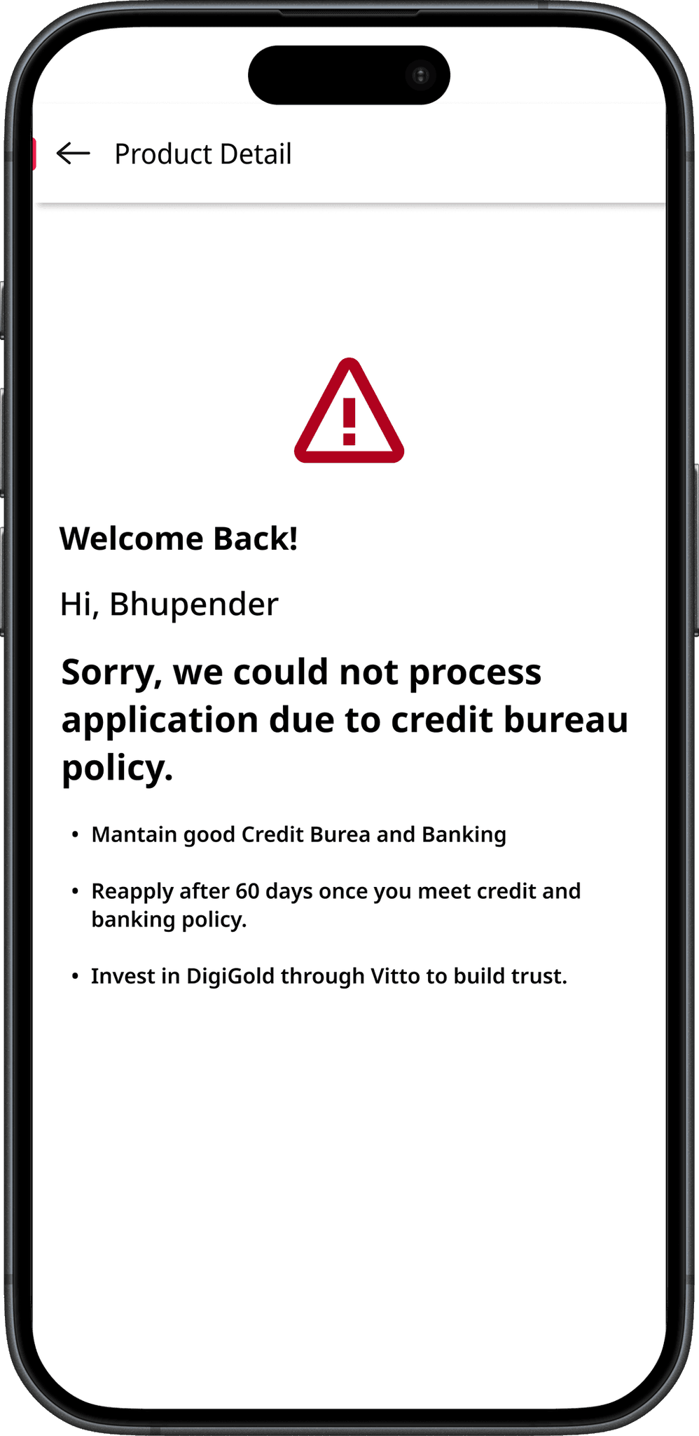
Clear States
Clear states were designed to guide users through every scenario with transparency and confidence. Each screen communicates progress or errors in plain language, reducing uncertainty and preventing drop-offs. By making system responses visible and human, users always know where they stand and what to do next.
Clear states were designed to guide users through every scenario with transparency and confidence. Each screen communicates progress or errors in plain language, reducing uncertainty and preventing drop-offs. By making system responses visible and human, users always know where they stand and what to do next.
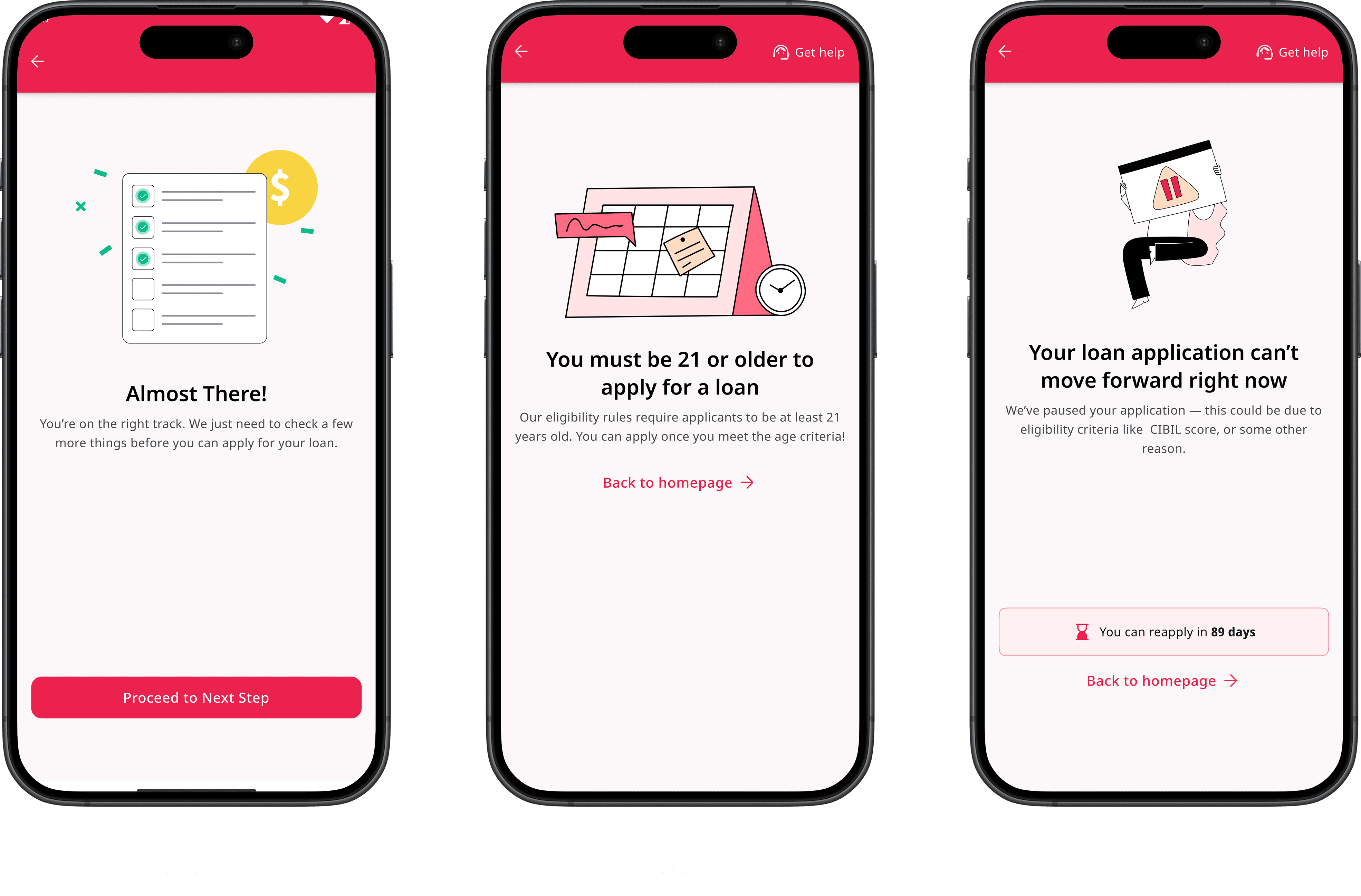
Almost There! screen (progress motivation): Designed to provide a sense of accomplishment after clearing previous steps, motivating users to continue with the next form through positive reinforcement.
Almost There! screen (progress motivation): Designed to provide a sense of accomplishment after clearing previous steps, motivating users to continue with the next form through positive reinforcement.
Age restriction screen (eligibility rejection): Communicates ineligibility due to age in a clear and empathetic tone, reducing frustration and guiding users smoothly back to the homepage.
Age restriction screen (eligibility rejection): Communicates ineligibility due to age in a clear and empathetic tone, reducing frustration and guiding users smoothly back to the homepage.
Age restriction screen (eligibility rejection): Communicates ineligibility due to age in a clear and empathetic tone, reducing frustration and guiding users smoothly back to the homepage.
Age restriction screen (eligibility rejection): Communicates ineligibility due to age in a clear and empathetic tone, reducing frustration and guiding users smoothly back to the homepage.
Gamified Experience

Introduced a progress bar for better task awareness — added a visual progress indicator within the loan application form to help users understand their current stage and the remaining steps. From a UX perspective, showing progress creates a sense of control and completion motivation, encouraging users to finish the process with more confidence and less drop-off.
Introduced a progress bar for better task awareness — added a visual progress indicator within the loan application form to help users understand their current stage and the remaining steps. From a UX perspective, showing progress creates a sense of control and completion motivation, encouraging users to finish the process with more confidence and less drop-off.
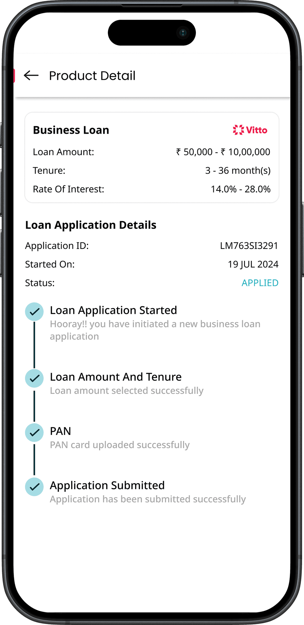
Product Detail- Post Applied
The product detail page helps users track their loan progress after applying. It displays key details, current status, and pending tasks, giving users a clear view of what’s completed and what’s needed next for faster approval.
The product detail page helps users track their loan progress after applying. It displays key details, current status, and pending tasks, giving users a clear view of what’s completed and what’s needed next for faster approval.

Color-coded guidance: All key information and actions were color-coded, helping users quickly understand loan status, pending tasks, and next steps at a glance.
Smarter document uploads: Added an option to upload extra documents early, allowing faster verification and reducing repetitive uploads in later stages.
Homepage- Post Applied
The homepage after application helps users stay updated on their loan progress. It highlights their current stage, shows pending actions, and provides clear guidance on what’s next — making the experience transparent and easy to follow.
The homepage after application helps users stay updated on their loan progress. It highlights their current stage, shows pending actions, and provides clear guidance on what’s next — making the experience transparent and easy to follow.

Added a visible “View Status” signifier — introduced a clear text cue that indicates users can tap on the loan status card to view their progress, solving the earlier issue where this interaction was hidden and often missed.
Added a visible “View Status” signifier — introduced a clear text cue that indicates users can tap on the loan status card to view their progress, solving the earlier issue where this interaction was hidden and often missed.
Introduced an “Optional Documents” card on the homepage — allows users to proactively upload supporting documents, helping them speed up their loan approval process and reduce document requests in later stages.
Introduced an “Optional Documents” card on the homepage — allows users to proactively upload supporting documents, helping them speed up their loan approval process and reduce document requests in later stages.
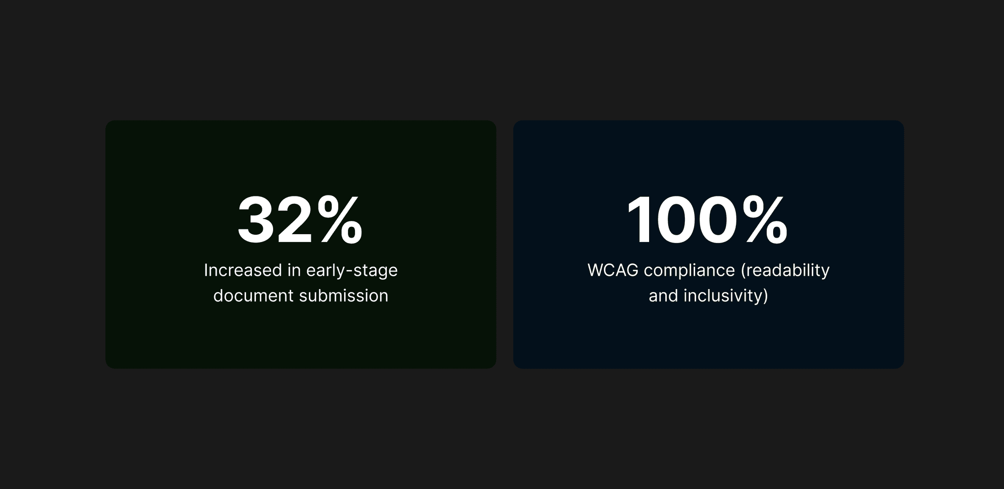
Impact
Impact
Impact
💥 Impact
💥 Impact
💥 Impact
The redesign made the loan process clearer and more intuitive for users. Improved navigation, better readability, and visible progress cues helped users feel more confident completing tasks independently, creating a smoother and more trustworthy experience overall.
The redesign made the loan process clearer and more intuitive for users. Improved navigation, better readability, and visible progress cues helped users feel more confident completing tasks independently, creating a smoother and more trustworthy experience overall.
Reflection
Reflection
Reflection
🔍 Areas for Improvement & Constraints
🔍 Areas for Improvement & Constraints
🔍 Areas for Improvement & Constraints
Proposed smoother login options like DigiLocker integration to simplify document verification, but it couldn’t be implemented due to financial limitations. With it, the overall loan journey could have been far more seamless.
Proposed smoother login options like DigiLocker integration to simplify document verification, but it couldn’t be implemented due to financial limitations. With it, the overall loan journey could have been far more seamless.
The form length changed frequently with different lending partners, which made it challenging to maintain a consistent user experience across all stages.
The form length changed frequently with different lending partners, which made it challenging to maintain a consistent user experience across all stages.
Could involve users in usability testing to validate design decisions before implementation.
Could involve users in usability testing to validate design decisions before implementation.
Future iterations can focus on optimizing performance and micro-interactions for smoother experience on low-end devices.
Future iterations can focus on optimizing performance and micro-interactions for smoother experience on low-end devices.
🎓 Key Learnings
🎓 Key Learnings
🎓 Key Learnings
Designing for low-end devices requires simplicity and lightweight visuals — optimizing layouts, assets, and interactions ensures smooth performance even on limited hardware.
Designing for low-end devices requires simplicity and lightweight visuals — optimizing layouts, assets, and interactions ensures smooth performance even on limited hardware.
Small accessibility changes can create big impact — improving font size, spacing, and contrast significantly enhances readability and overall usability for all users.
Small accessibility changes can create big impact — improving font size, spacing, and contrast significantly enhances readability and overall usability for all users.
When designing for users with low digital literacy, usability comes before delight — clarity, guidance, and predictability build trust faster than advanced visuals or micro-interactions.
When designing for users with low digital literacy, usability comes before delight — clarity, guidance, and predictability build trust faster than advanced visuals or micro-interactions.
Conclusion
Conclusion
Conclusion
🧩 Redesigning with Purpose
🧩 Redesigning with Purpose
🧩 Redesigning with Purpose
Redesigning Vitto’s upper loan funnel was about more than improving visuals — it was about creating clarity, trust, and accessibility for users taking their first step into digital finance. By focusing on the early application experience, the redesign simplified navigation, reduced drop-offs, and made the loan process more transparent and self-driven.
Redesigning Vitto’s upper loan funnel was about more than improving visuals — it was about creating clarity, trust, and accessibility for users taking their first step into digital finance. By focusing on the early application experience, the redesign simplified navigation, reduced drop-offs, and made the loan process more transparent and self-driven.
💡 If you’d like to explore more of my design work, feel free to check out my portfolio.
And if you have any opportunities or feedback, I’d love to connect with you on LinkedIn.
💡 If you’d like to explore more of my design work, feel free to check out my portfolio.
And if you have any opportunities or feedback, I’d love to connect with you on LinkedIn.
Always up for design convos, feedback swaps, or geeking out over interfaces
Always up for design convos, feedback swaps, or geeking out over interfaces

If you're building something thoughtful, I'd love to hear from you
If you're building something thoughtful, I'd love to hear from you
If you're building something thoughtful, I'd love to hear from you
©2025 Designed by Sourab Jha (Portfolio ver. IV)